
I rebuilt my portfolio with Claude Code in three hours. These are the prompts.
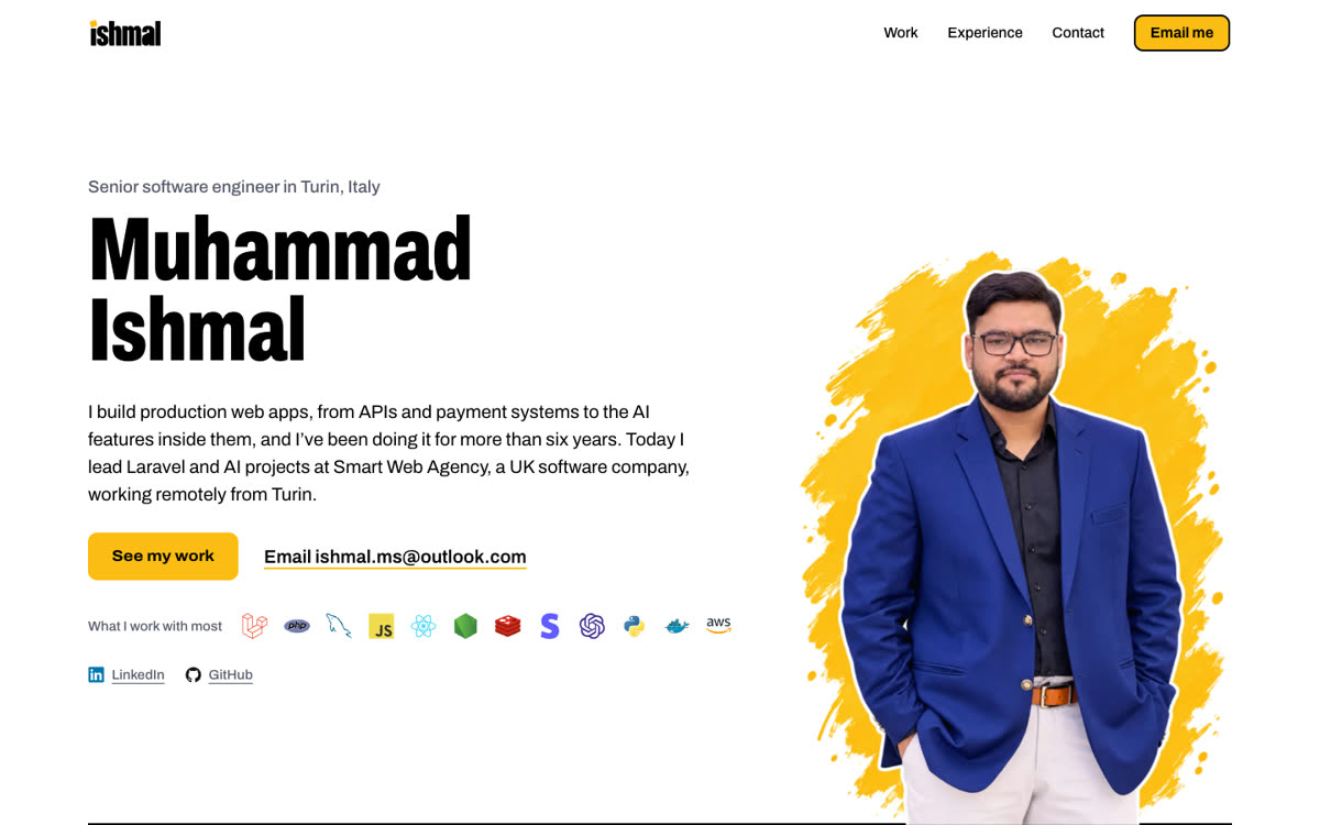
This site took about three hours of my time. Not three hours of writing code. Three hours of typing to Claude, looking at what came back, and saying “no, not like that”.
Here’s how it went, with the prompts I sent.
The setup was small: Claude Code in the desktop app, open on my Laravel 12 portfolio repo, with three skills switched on. HyperFrames turns HTML into video. frontend-design and ui-ux-pro-max push the layout away from the usual template look. Laravel Forge deploys it.
1. Start with one picture, not a spec
I didn’t write a brief. I dropped in my photo and said what I wanted to feel:
This is the picture I’ll be using. Let’s start with the hero section of the redesign. I want to keep it simple: light white backgrounds with primary colours. I’m also happy to add some really cool Three.js visualisations. I’m thinking of using the HyperFrames skill to bring in the main picture, with animated frames loading from left to right, like an animated video introduction of me that shows the skills I have and the tech stack I work with.
It came back with two versions. I picked one and asked for exactly one change:
I like variant B, but I’d like the icons to be in colour, not plain black.
That’s the hero at the top of this post. And that’s the rhythm for the whole build. Reacting to something real beats describing something imaginary.
2. Make the work move with HyperFrames
A portfolio of screenshots is forgettable, so I asked for something louder. Yes, in capitals:
WE HAVE TO PRESENT IT IN A VERY VISUAL WAY: SCREENSHOTS OR MOCKUPS, 3D, ANIMATED, SCROLL-DRIVEN, THE WORKS. MAYBE WE CAN CREATE A HYPERFRAMES MOTION DESIGN FOR ONE PROJECT FIRST AND TAKE IT FROM THERE.
This is where HyperFrames earns its place. Each film is just an HTML page whose elements carry timing attributes. HyperFrames plays it frame by frame and renders an MP4. Claude writes a short brief first, then the composition. The brief for the resume screening film starts like this:
message: "27,431 applications screened in 9 days,
          almost 72% less manual work."
length: 18.5s
- 0.0–3.5s   a clock counts 0 → 18h
- 3.5–7.5s   CV cards drop into a Redis queue
- 7.5–11.5s  a counter climbs to 27,431
Halfway through, I changed my mind about that project’s animation:
Actually, I have something better in mind. A Kanban board of a proper recruitment pipeline. The AI screening scans the CVs in the “Under AI review” stage, picks a few of them and moves them to the next stage. Hovering over each one then shows a tooltip with its AI screening results.
3. Say no early
Claude will happily build too much. My experience section came back packed with animation. My reply:
To be honest, it’s too much animation. I’d like something simple: either a horizontal or a vertical reveal on scroll.
Then “build both for me”, and I kept the horizontal one. One plain sentence saved more time than any amount of tweaking would have.
4. Feed it your real numbers
Every figure on this site is real, so the facts came from me:
The order and shipping label module for Squatwolf helped the warehouse team ship more orders. In the 2021 Birthday Sale, we grew 220% year on year, from $1.7M in 7 days to $4.8M in 7 days. Calculate the percentage and add that point.
It did the maths and corrected me. $1.7M to $4.8M is up 182%, not 220%. The site says 182%. I’d rather a recruiter checks my numbers and finds them right.
5. Then let Claude scale it
Once the pattern worked, I pointed it at years of old freelance code:
In this folder you’ll find all my previous projects. Explore each one: what it does, its tech stack, its features and its UI. Then we can add them to the work page and give each one its own case study. Keep CinemaPlus as an NDA client, but explain the system :)
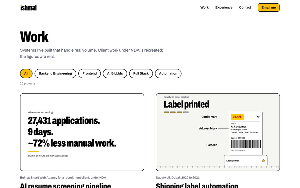
It read each codebase and came back with what the project does, its stack and its screens. The rules stayed mine: one client stays anonymous, and when there wasn’t a big number, “just highlight the features they offer.” That’s how the work page got to 15 case studies, most with their own film.
6. Make it fast
THE ONE THING I DON’T WANT ON THIS WEBSITE, ONCE IT’S DEPLOYED ON LARAVEL FORGE, IS SLOW LOAD TIMES. HOW DO WE IMPROVE THAT?
Self-hosted fonts, AVIF images, cacheable pages, and films that only download when you actually look at one. PageSpeed on mobile went from 70 to 95.
What I’d tell you about building with Claude Code
- React, don’t specify. Ask for a first version, then say what’s wrong with it.
- Give it your real data. It won’t invent numbers if you hand it the right ones.
- Use capitals for the one thing that matters. It works on Claude. It probably works on people too.
- Keep the taste. Every “no” I typed made the site better. That part is still your job.
If you’re building something similar and want the full prompt list or a HyperFrames brief to start from, email me. I’m happy to share.